
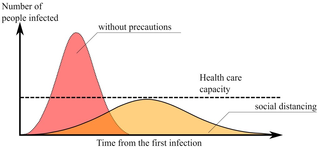
We are in it. The message is clear. Stay home. Flatten the Curve! It’s the lead message. There is a graphical icon included in these public announcements- no doubt you have already seen it quite often.
Credit: Johannes Kalliauer
This graph is very motivating for understanding and obliging the “Stay Home” mandates. This is good. On the other hand, it is also very static. Notice how the infection rate sections shown in the yellow and pink areas change over time? Now, look at the black dotted line. This shows our healthcare system completely stopping-out at a specific capacity level.
Nobody wants our healthcare system to be beyond capacity. We all want to stop the spread of this virus. No question, the stay at home state-level mandates are designed to decelerate the spread. However, this popularized graph is limited. It is only doing a good job in supporting the public announcements. It is not doing a good job at showing the broader picture of possibilities.
Let’s begin to think ahead.
Extraordinary efforts are getting funneled into expanding and supporting the US healthcare system. Public and private organizations for supplies, testing and facilities are all looking for ramped up solutions. The war time analogy is in full swing. The US has historically accomplished massive supply expansion many times over and optimistically speaking, it will probably happen again. This time, it will just be different players stepping in.

Back to the graph. So, if we believe that the US can successfully and rapidly respond and expand the current healthcare infrastructure, then that static dotted line on the graph now becomes a dynamic one.
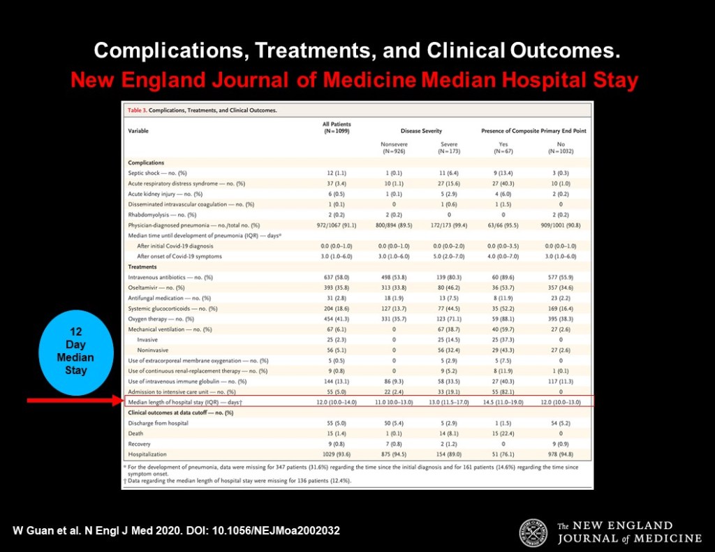
Duration of care is the other dynamic. In other words, while we do know percentage-wise how many are likely needing to be admitted into the hospital– the question is how long do they need to stay there before they can go home?In the US, we don’t really know yet. However, there are is seemingly sound data coming out of China. In February 2020, The New England Journal of Medicine cited that, in China, the median hospital stay was 12 days.
In terms of supply and demand, patients are the demand side and healthcare is the supply side. Since solutions are in full swing, supply side is not static as currently shown in the popular public announcements graph. It would be good to start seeing what the models look like with additional supply brought into the system. Then, layer on the projected length of hospital stay. With all this, we could have a much clearer picture of what higher demands really look like upon the US healthcare system.
If this information were to start being shared publicly, it might also reduce some of the general anxiety being felt by so many. So far, mostly all we hear about every hour are the rates of those that got Covid-19 and how many have passed from it. Not surprising that so many folks are so anxious.

Another interesting observation would be to compare it to socialized medicine. Much has been presented that socialized medicine excels at everyday distribution versus the US model. What is uncertain, though, is the question as to whether the socialized healthcare model can scale as efficiently as the capitalist one? Past history supports that the US dominates in scaling up. A study of these effects could be beneficial as we continue with the debate on the effectiveness of our current system.
Within nearly every facet of this situation, there is much to be learned. Every socioeconomic segment of all our lives are being effected. Let’s hope we can all soon scale from it.

